Customisable Data Views and Advanced Filtering
The Cambrionix Connect application provides a highly customisable and user-friendly experience for managing and viewing information. Each table of data can be displayed in various formats, allowing users to tailor the presentation to their specific needs. Columns can be selected to be visible or hidden, giving complete control over the information displayed at any given time. Users can also adjust the density of the data view, making it possible to choose between a more compact layout for a high-level overview or a more spacious format for detailed analysis.
To further enhance usability, powerful custom filtering options are available, enabling users to isolate and focus on specific subsets of data quickly and efficiently. Once tailored to their requirements, users can export all or filtered data as a CSV file, ensuring seamless integration with external tools and workflows outside the application.
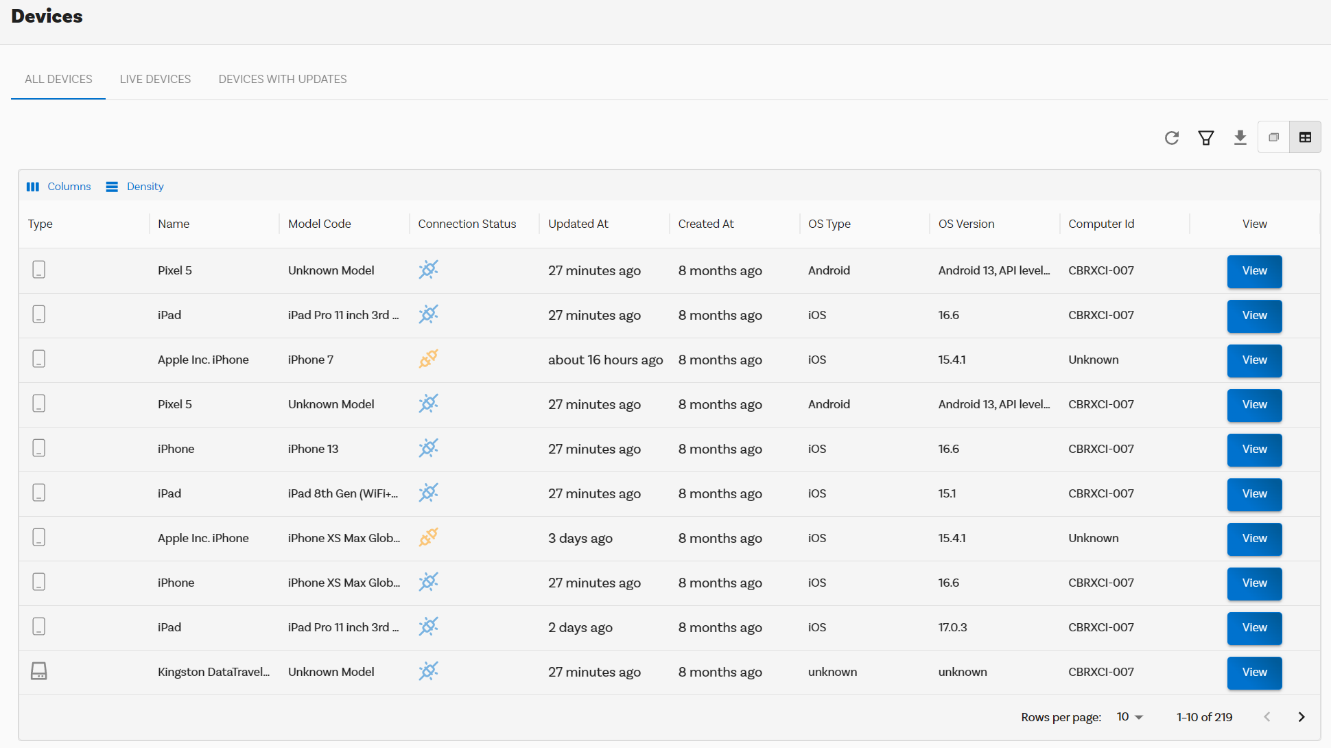
Different views
There are two different views that can be used within the Cambrionix Connect application:
'Card view'
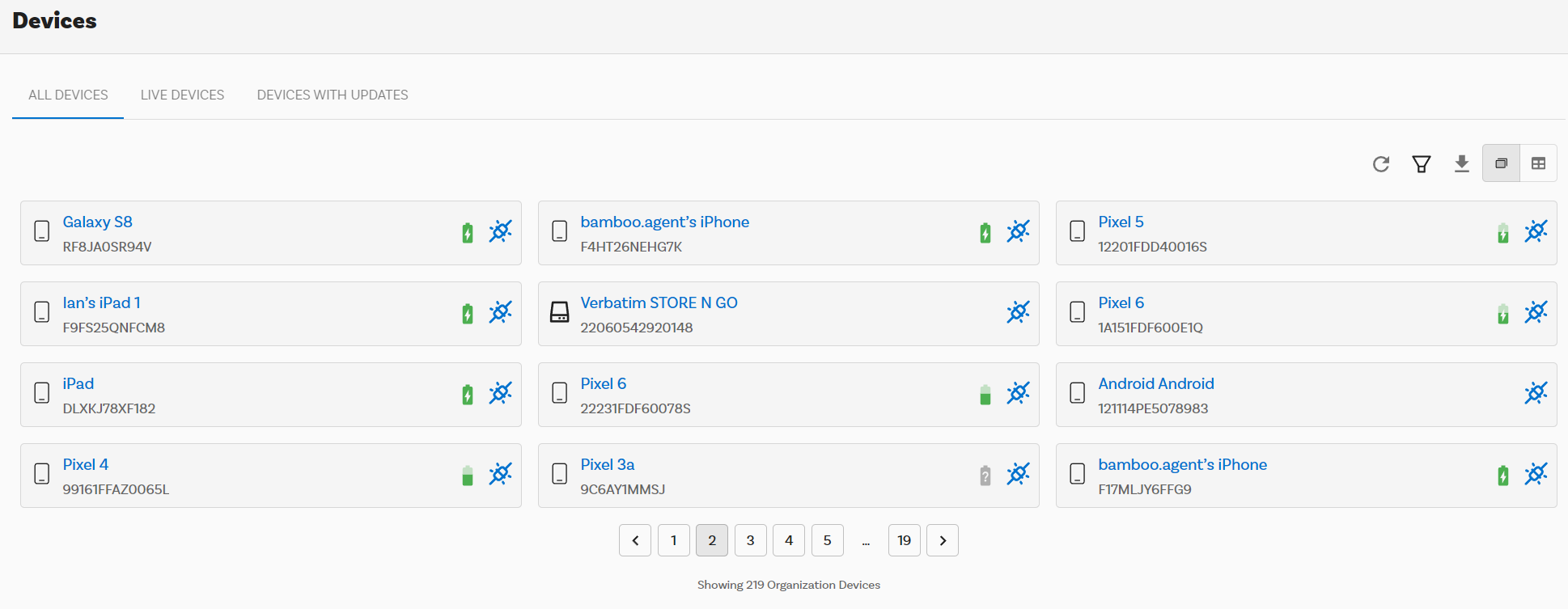
'Table view'
Filtering
You can filter the information in a variety of ways, from 'Table view' you can select 'Columns' and select and de-select columns that you wish to have visible or not.
This advanced filtering interface is designed to allow users to create custom queries and refine datasets based on multiple conditions. It provides a flexible and user-friendly approach to narrow down large amounts of data to meet specific requirements.
Creating Filters
There are two different ways that you can create a filter, you can either just open up the filter menu and start adding in conditions to filter the view you currently have, or you can create a 'Saved Filter' which will save to your current organisation for any users to use going forward.
To start creating a filter you will need to select 'Add a new Condition' you will then have a new condition added to your filter. Each condition consists of three components:
| Component | Description |
|---|---|
| Field | A dropdown menu where users select the data attribute or column they want to filter, such as "Id" or "Connection Status." |
| Operator | A dropdown menu defining the logic for filtering, such as "Equals," "Contains," or "Does Not Equal." |
| Value | A text box where users enter the specific value or criteria they are targeting, such as a specific ID number or status. |
To create more complex queries, users can click the "Add new condition" button, which adds another row to the filter configuration. Each condition can also be individually deleted using the trash bin icon, ensuring users can easily modify or remove unwanted conditions.
At the bottom of the interface, there are two action buttons:
| Action | Description |
|---|---|
| Apply | Executes the filter and refines the displayed dataset based on the conditions specified. |
| Close | Closes the filter interface without applying any changes, allowing users to exit without affecting the data view. |
There is also the option of selecting the plus symbol next to the dropdown which will then add the filter as a 'Saved Filter' for use within your organisation.